
Insure Your paws
Product background:
GAT Labs is an audit and cybersecurity tool, a leader in the Google workspace space. The company’s main product, GAT+, is a management, reporting and cybersecurity solution for Google Workspace admins.

Product Overview
The problem:
-
Outdated UI in an innovative, fast-changing and competitive industry.
-
The original design displayed complex data that was challenging for users to comprehend.
-
As a result of poor UI, friction was added to the user’s experience which limited usability and ultimately reduced free trial conversion rates.
The goal:
-
Update UI to be in line with current industry trends and practices - this was to be determined by extensive research.
-
Convert data displayed into an intuitive, graphical and organised representation.
-
Increase usability to allow users to leverage the features during the free trial so that they convert into paying customers.
Methodology

User research: Summary
Firstly, for the enterprise market, a user group identified through research consisted of various decision makers such as Google Workspace admins, heads of IT, company directors, CFO, COOs, CTOs and CEOs.
Secondly, for the education market, a user group identified through research consisted of decision makers such as Google for Education admins, K12 district admin and school teachers.
This user groups confirmed initial assumptions about GAT+, research also revealed that a poor UI was not the only issue. Other user problems included challenges that make it difficult to manage the applications’ data representation.
User research: Pain points
Data representation
The data being presented, was presented in tables which was not suitable for the users experience.
Accessibility
The user needed colours that were colour blindness friendly and icons to help assist them in actions being taken.
IA
Organisation, structure and labeling.
Usability study findings
Round 1 findings
-
Users want more customization options.
-
Users prefer a graphical representation over tables, but also the option of having both.
-
The ability to remove sections and bring them back if needed.
Round 2 findings
-
Some users appreciated the size of the icons. One stating “The icons are fantastic, my eyesight is weak so this is great”.
-
The study highlighted that users wanted to have all information without scroll where possible.
Style Guide
Colour Palette

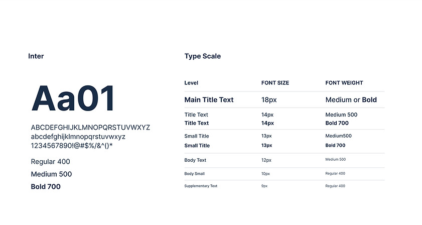
Typography
Buttons

Icons

The original UI
A snippet of the original UI
Outdated, condensied and data overloaded

Mockups
A selection of the 100+ interfaces designed by me
Click any image below to expand
Please note that the designs below are prototype designs for usability testing, they are not the final design. Due to the NDA, I am unable to display my entire finished work.
 |  |  |  |
|---|---|---|---|
 |  |  |  |
 |
Accessibility considerations
A colour-palette that is accessible for colour-blindness. This was the most important as the transition to a graphical representation meant using lots of colour. 1 in 12 men and 1 in 200 women suffer from 1 of the 7 types of colour-blindness, this had to be accounted for.
Consistent navigation to ensure that repeated components occur in the same order on each page of the site.
An option to enlarge tiles for better visibility for people with weak eyesight.
Takeaways
Impact:
Upon implementation of the new UX/UI of GAT+, as reviewed after a 6 month period:
Conversion rates from GAT’s 15 day free trial promotion increased by 27% YoY.
What I learned:
I learned how to take an outdated UI and redesign it, using many types of graphical representations. I also learned how to implement different types of accessibility standards, such as creating brand guidelines by adding a new colourblind palette.
Next steps
Integrate a quarterly review of the UI through conducting interviews with not only prospects on the free trial but also with existing customers, in order to promote customer retention.
Implement a new ‘usability score’ and ‘satisfactory score’ KPIs into the company. The usability score would help the company track how much users are leveraging the features and a satisfactory score allows users to provide continuous feedback.